Best Memorable Print Ads of All Time
In a world where digital advertising is a predominant marketing model, it is hard to believe that traditional formats still play a significant role for businesses. Print ads have been around since the 15th century. However, it’s the last 100 years that have contributed most to what we now think of as the modern print ad. Hence a powerful medium as the print has time again proved that it is here to stay.
Moreover, industry reports prove the evergreen potential of print advertising which claims that 70% of Americans prefer to read on paper, and 67% prefer printed materials over digital. Over 55% of all consumers trust print marketing more than any other advertising method.
However, it takes a great chunk of print content and creative strategies for design agencies to evoke emotions and inspire customer interest. Marketers need to make sure to display a fair share of inspiration and creativity. The quality of a print ad depends mostly on these traits, and that can be proved by the following few top print ads.
Volkswagen: Think Small (1960)
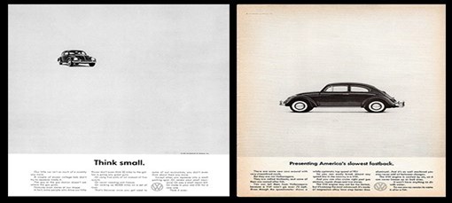
The old Volkswagen advertisements are some of the greatest ads of all time and none more so than the iconic ‘think small’ campaign. It is no understatement to say that this campaign totally changed the face of advertising forever. Before this in the 1950s car ads were all very generic, full page spreads with beautifully hand drawn cars with perfect American families driving them. All this changed when the company opted for a radically different approach and challenged the status quo! They did not try to compete with classic American car manufactures and instead opted to highlight all of the other good but seemingly ordinary benefits of not owning a huge muscle car. The designers at DDB did this by literally telling the audience to think small, not only in its copy but also through its use of imagery, by having a tiny picture of a beetle on full page spread. The ad instantly drew huge publicity and boosted sales of the Volkswagen Beetle in America massively, turning into a now iconic car of all times.
Clairol(1957):
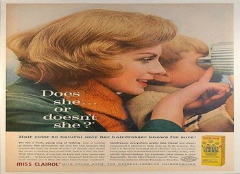
The first time Clairol asked the question ‘Does She, or Doesn’t She?’ in 1957, the answer was 1 to 15 as in, only 1 in 15 people were using artificial hair colour. Just 11 years later, the answer was 1 of 2, according to TIME Magazine. The ad was apparently so successful that some states stopped requiring women to denote hair colour on their driver’s license. When an ad campaign starts changing things at the DMV, creators know that it hit a nerve.
Clairol took a detour from what most marketers would follow. They didn’t want every woman on the street going around saying they were using their product. Instead, they wanted women to understand that their product was so good that people wouldn’t be able to tell if they were using it or not. A simple lesson learnt: By simply conveying how and why a product works is enough for consumers. Showing becomes more effective than telling.
De Beers: A Diamond is Forever (1999)
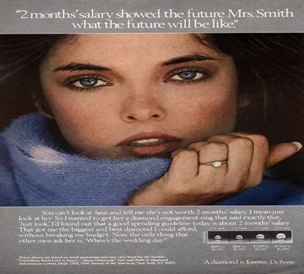
The slogan, “A Diamond is Forever” became the most striking slogan of the twentieth century. In 1999 AdAge declared De Beers’ slogan as the most memorable line. The campaign, which proposed the idea that no marriage would be complete without a diamond ring, presented the idea that a diamond ring was a necessary luxury. According to the New York Times, N.W. Ayer’s plan was to “create a situation where almost every person pledging marriage feels compelled to acquire a diamond engagement ring.” The brand successfully showed that right advertising can make a relatively inexpensive product seem luxurious and essential.
Wendy’s: Where’s the Beef? (1984)
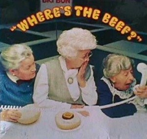
Wendy’s campaign directly targeted its competitors to point out the lack of beef in competitors’ burgers by using a simple phrase “Where’s the beef?“. As a result, it quickly became a catchphrase that captured all that was missing in their audience’s lives. It cannot be predicted if a catchphrase will catch on or not; therefore, Wendy’s did not over-promote their hit phrase. The campaign only ran for a year, and was allowed to gently run its course.
KFC: “FCK” (2018)

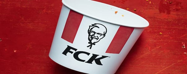
This ad is an apology, and perhaps the most creative one of all time. In February 2018, KFC’s business in the UK ran out of chicken. Now it is one of the most unusual situations for a business to stumble upon the most ironic PR crisis in company history, so when it happens, all eyes are on the business’s response. But KFC stuck the back with a full-page ad in Metro, a UK newspaper, rearranging its three famous initials to create a hilarious albeit explicit response to its product shortage. The ad depicts a KFC bucket that reads, “FCK“. Beneath this design, the company goes on to apologize for what it realizes is an inexcusable error. Businesses must remember that there is nothing above a good old-fashioned sorry, and it gets better with a tinge of humour. KFC’s ad demonstrates how to combine humility, class, humour, and ultimately company pride in a message that can help a company bounce back from bad press and even come out the other side with a net-positive result for the brand.
Coke: Share a Coke(2011)
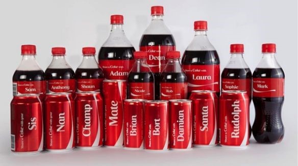
Big brands often reel under the pressure doing something ground-breaking when they’re already so big. That is exactly what Coca-Cola did to appeal to the audience. They appealed to individuals by putting their names on each bottle. The Share a Coke campaign began in Australia in 2011, when Coca-Cola personalized each bottle with the 150 most popular names in the country. Since then, the U.S. has followed suit, printing first names across the front of its bottles and cans in Coke’s branded font. People can even order custom bottles on Coke’s website to request things like nicknames and college logos. This gained immediate response from the masses. Coke fans who are regular buyers made the company to lean into that sense of individual ownership with full force. Wondering what name will come up, an individual would get to the vending machine, which by itself is fun. It further encourages people to “share a Coke” with whoever’s name is on the front.
Absolut Vodka: The Absolut bottle
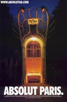
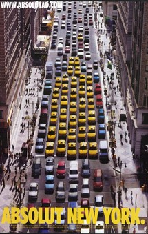
Despite having no distinct shape, Absolut made its bottle the most recognizable bottle in the world. Its campaign, which featured print ads showing bottles “in the wild,” was so successful that they didn’t stop running it for 25 years. It’s the longest uninterrupted ad campaign ever and comprises over 1,500 separate ads. When the campaign started, Absolut had a mere 2.5% of the vodka market. When it ended in the late 2000s, Absolut was importing 4.5 million cases per year, or half of all imported vodka in the U.S. This campaign once again proves that even though a product looks boring, it doesn’t mean that its story can’t be told in an interesting way.


